Amorim
Creative Direction: Studio Eduardo Aires
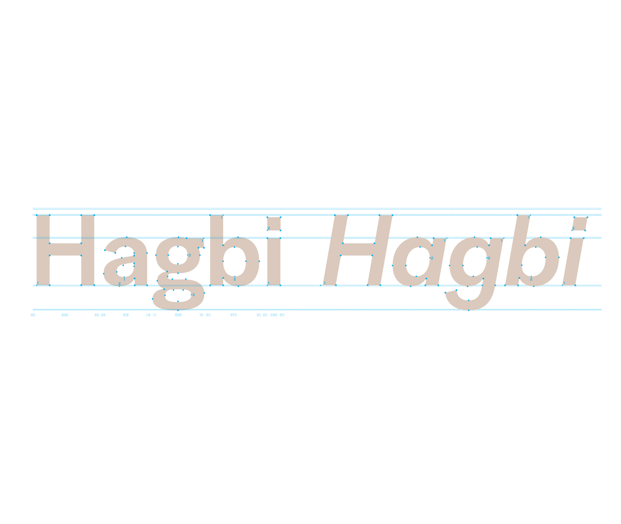
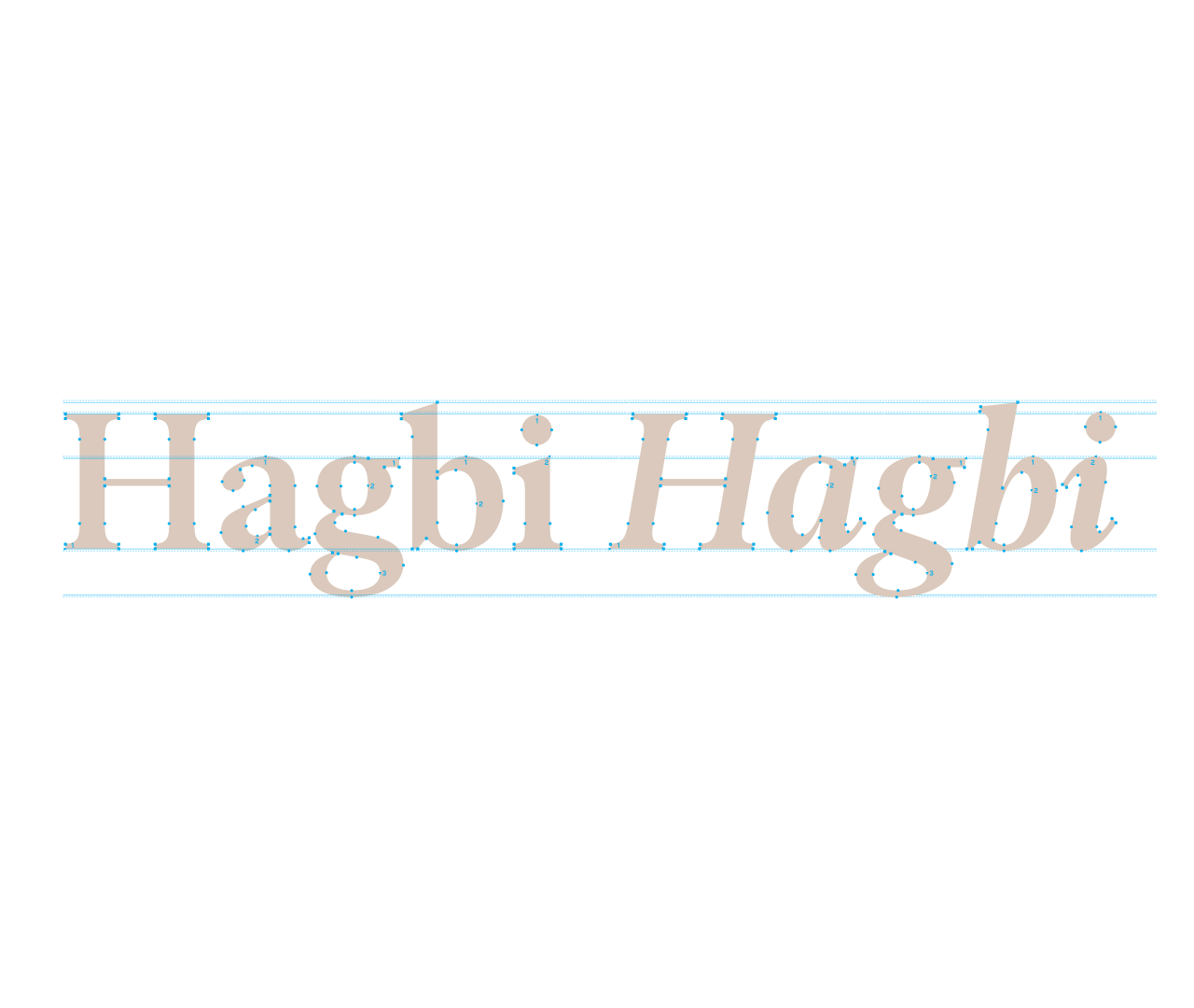
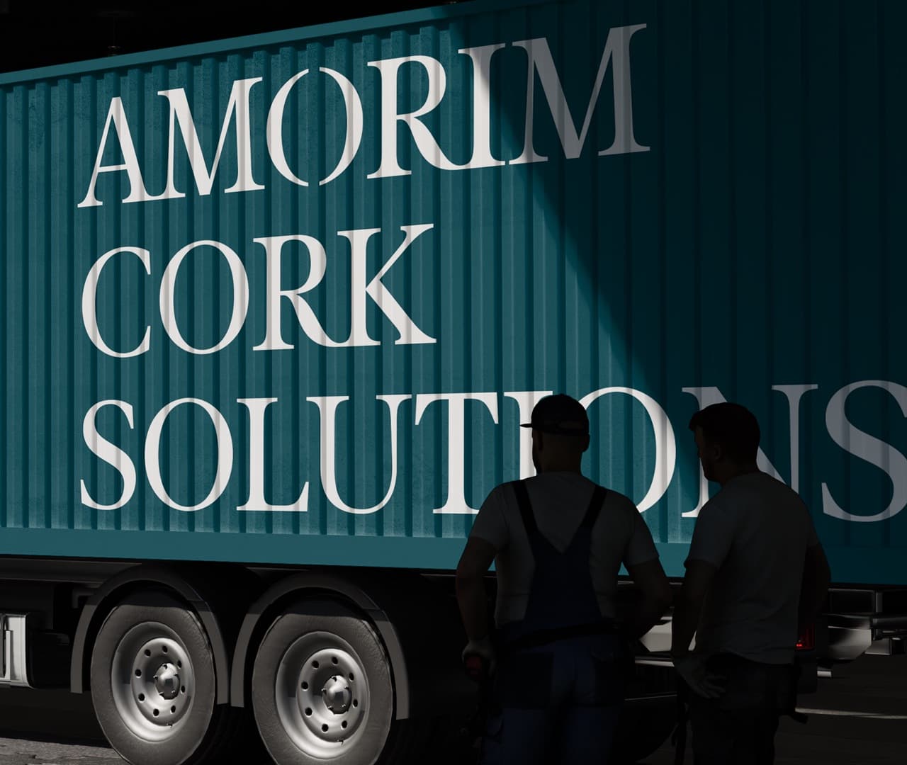
To mark its 150th anniversary, the Portuguese company Corticeira Amorim commissioned a new corporate identity. As part of this process, two complementary typeface families, Amorim Sans and Amorim Serif, were developed. Sharing a consistent approach to vertical metrics, weights, and italic styles, the two families form a cohesive typographic system. This pairing reflects the values of the Amorim Group, translating its heritage, vision, and international presence into a coherent and enduring visual identity.