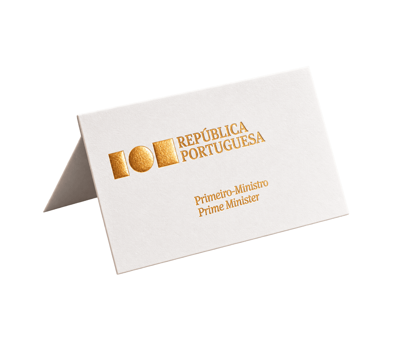
Amorim
Creative Direction: Studio Eduardo Aires
To mark its 150th anniversary, the Portuguese company Corticeira Amorim commissioned a new corporate identity. As part of this process, two complementary typeface families, Amorim Sans and Amorim Serif, were developed. Sharing a consistent approach to vertical metrics, weights, and italic styles, the two families form a cohesive typographic system. This pairing reflects the values of the Amorim Group, translating its heritage, vision, and international presence into a coherent and enduring visual identity.
ClearScore
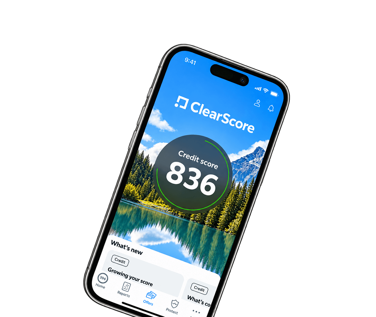
Creative Direction: Elliot Jay Stocks + ClearScore Design Team
Originally developed for ClearScore, a leading global financial technology company committed to improving people's financial well-being, CS Clarity was created to address the demands of a digital-first product ecosystem. Every aspect of the typeface was designed with usability in mind, delivering exceptional legibility at small sizes, clear distinction between similar characters, and a calm, approachable voice that inspires trust. These qualities are particularly valuable in financial products, where users rely on typography to quickly understand complex information and make informed decisions.
Erste Bank
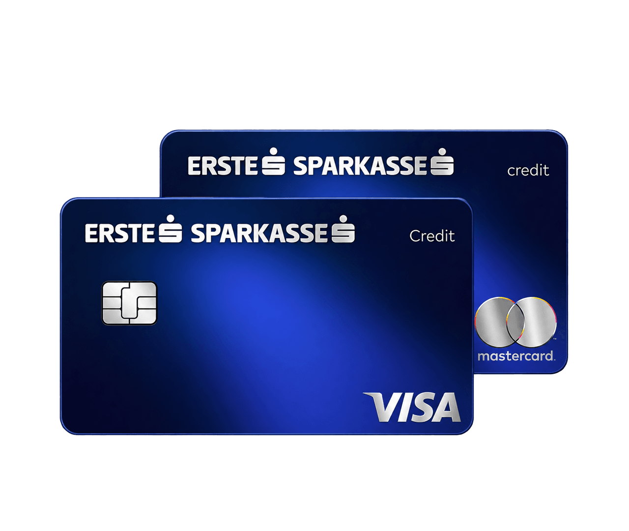
Creative Direction: Collettiva Design
The typefaces created for Erste Bank embody a modern, contemporary aesthetic that balances soft curves with clean, straight lines. This distinctive design approach sets them apart from traditional institutional typefaces typically used in the financial sector, offering a fresh and approachable visual identity while maintaining a sense of professionalism and trust.
Expo 2020 Dubai
Creative Direction: Brandia
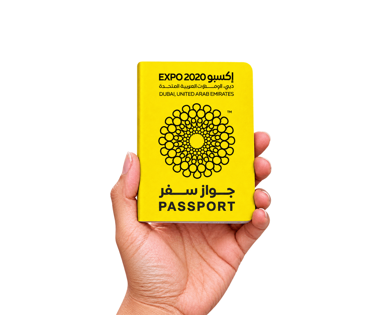
“Connecting Minds, Creating the Future.” This vision lies at the heart of Expo Sans, a bilingual typeface conceived to express the spirit of one of the world's largest international events. Designed as a unified typographic system for both Arabic and Latin, Expo Sans embodies openness, collaboration, and innovation—creating a visual language capable of communicating seamlessly across cultures and languages.
Grupo Lionesa
Creative Direction: Studio Eduardo Aires
The brief for the development of a typographic project for the Grupo Lionesa presented a wide range of challenges. Several entities, each with specific characteristics and operating across distinct fields, needed to coexist within a visual spectrum that, while diverse, would still read as a coherent whole. From the outset, we believed the ideal approach would be to unify the brands through a typographic signature broad enough to bridge classicism and modernity, tradition and innovation. Using the most recent tools in type production, we designed a typeface that traverses two centuries of typographic history.
Nations League
Creative Direction: VML Branding
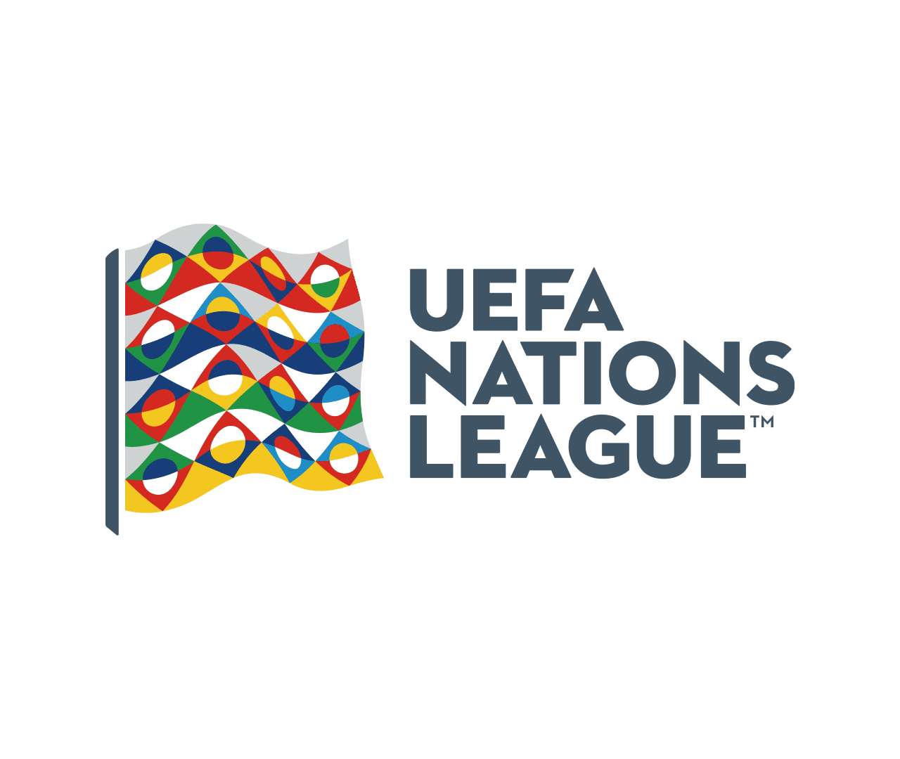
The custom typeface developed for the UEFA Nations League draws inspiration from the geometric language of the Art Deco movement, reinterpreting its timeless principles through a contemporary and distinctly humanistic approach. The design begins with three fundamental geometric forms—the square, triangle, and circle—which establish a disciplined underlying structure and provide consistency across the character set.
Novobanco
Creative Direction: BrandPractice
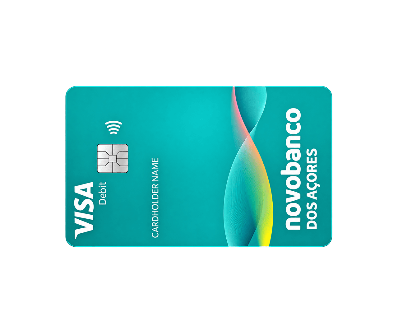
The Novobanco typographic system is conceived as a core structural element of the brand identity, operating as both a communicative tool and a visual signature across all offline and digital environments. Rather than functioning as a neutral carrier of information, the typeface is designed to actively express the brand’s positioning through form, rhythm, and proportion.
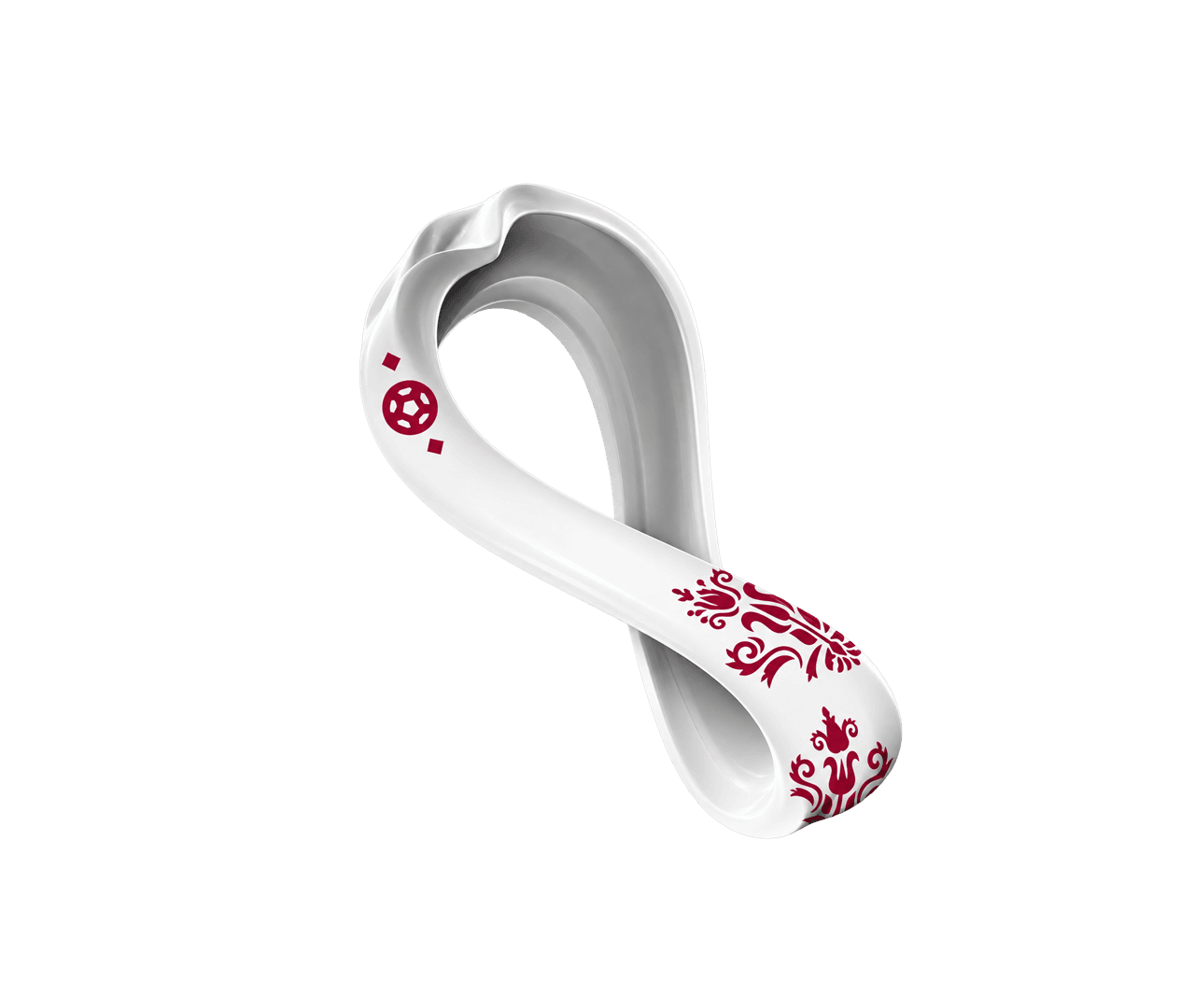
FIFA Qatar 2022
Creative Direction: Unlock Brands
The typefaces created for the FIFA World Cup Qatar 2022 embody a refined synthesis of contemporary design and cultural heritage. Conceived as an integral part of the tournament's visual identity, they were designed to express both modernity and timeless elegance while celebrating the rich traditions of the host nation and the universal spirit of football.
XXIII Governo
Creative Direction: Studio Eduardo Aires
The renewal of the communication strategy of the Government of the Portuguese Republic included the adoption of a new proprietary typeface, conceived as a foundational element of its visual identity. As a distinctive and unifying asset, it plays a central role in creating a coherent and consistent visual language across all communication platforms.