Grupo Lionesa
Creative Direction: Studio Eduardo Aires
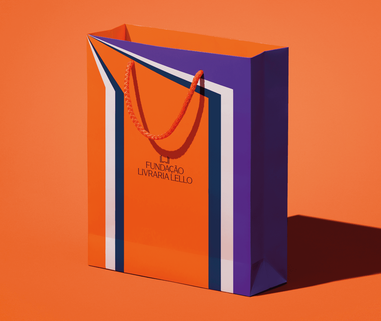
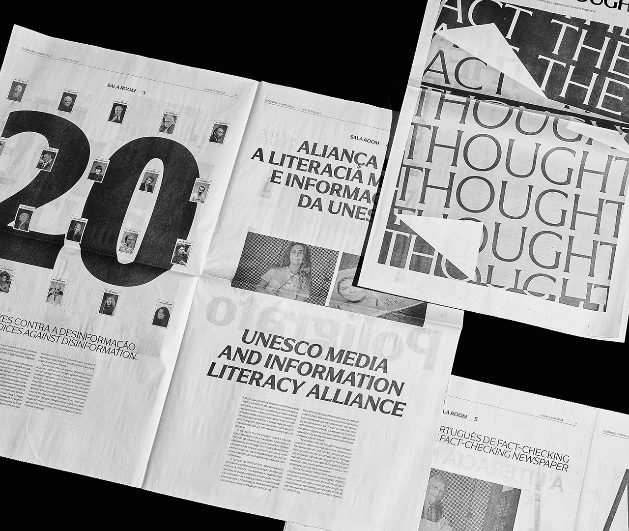
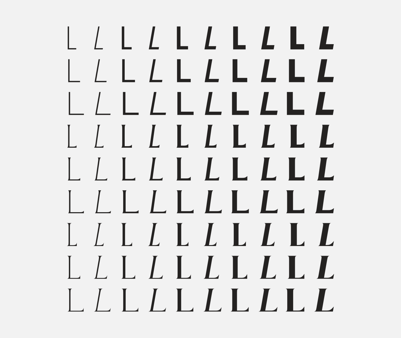
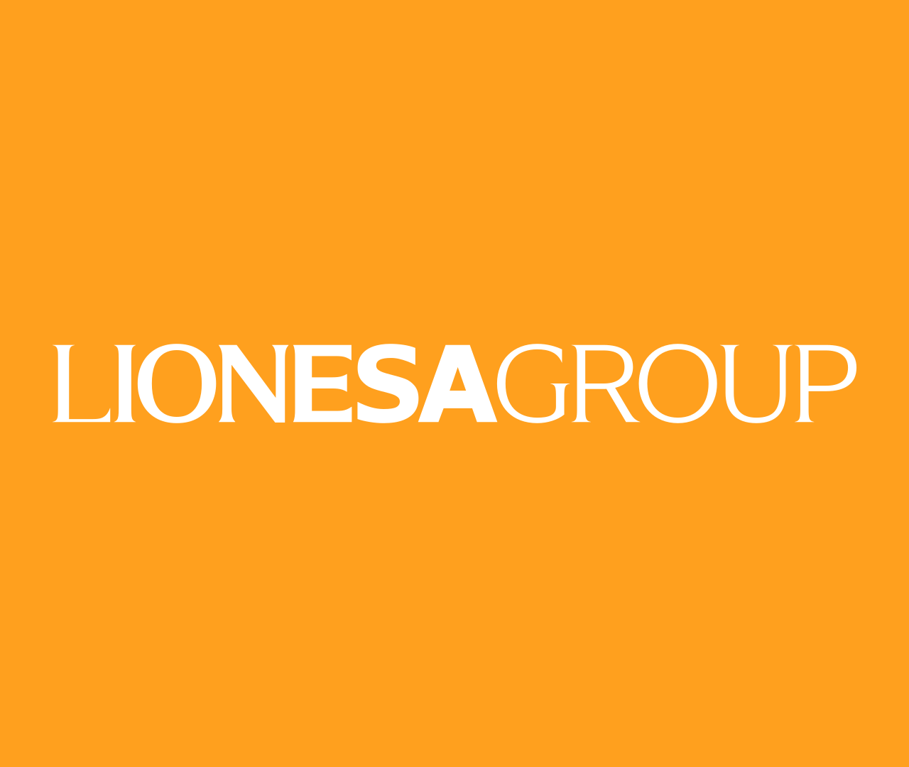
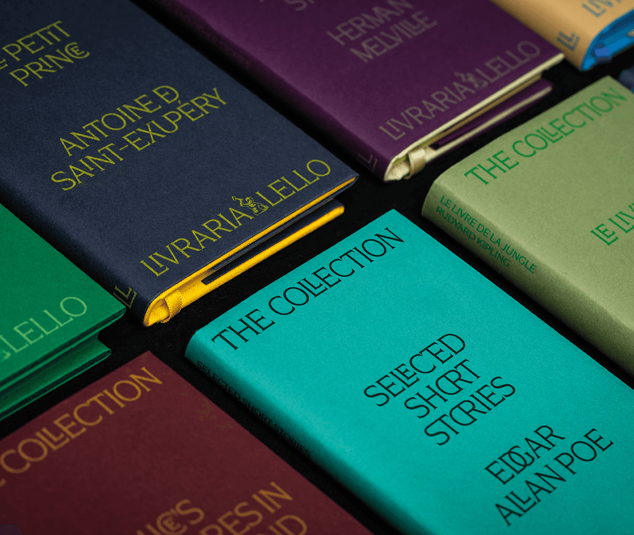
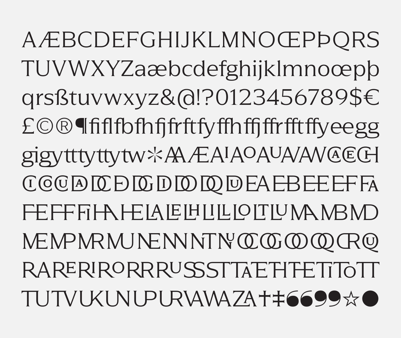
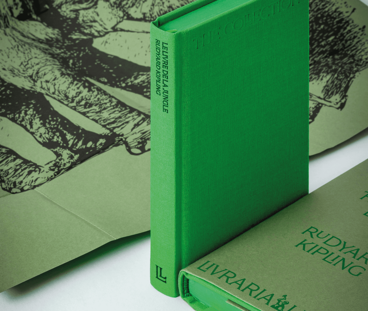
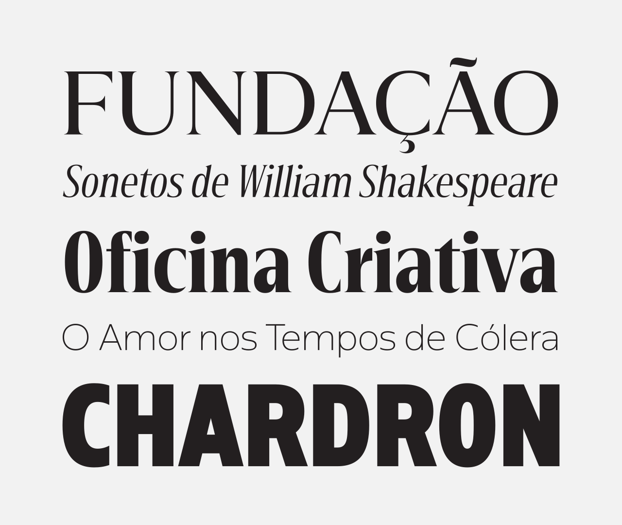
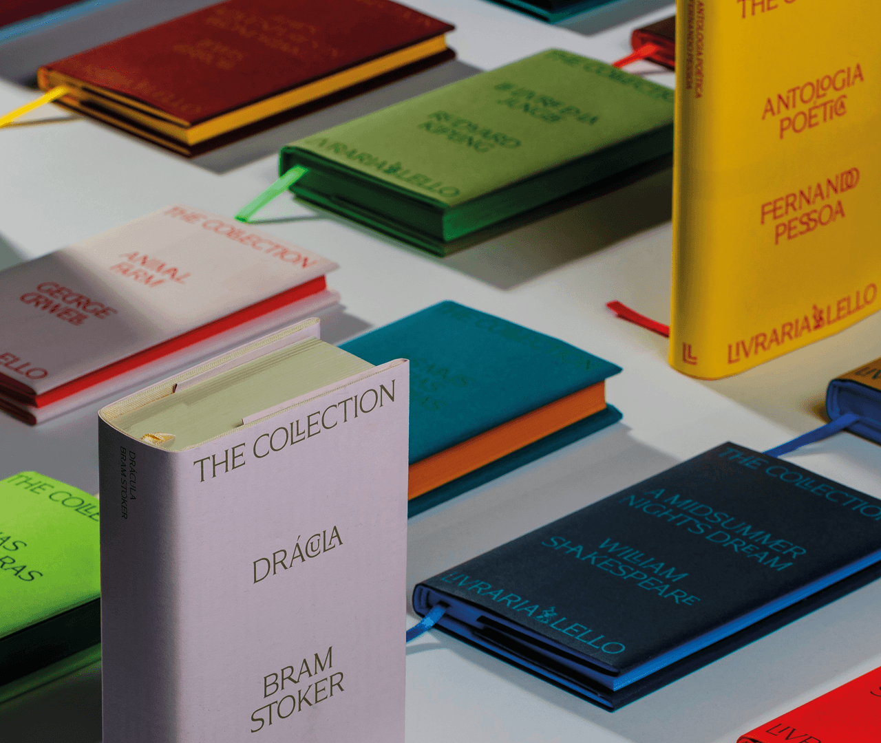
The brief for the development of a typographic project for the Grupo Lionesa presented a wide range of challenges. Several entities, each with specific characteristics and operating across distinct fields, needed to coexist within a visual spectrum that, while diverse, would still read as a coherent whole. From the outset, we believed the ideal approach would be to unify the brands through a typographic signature broad enough to bridge classicism and modernity, tradition and innovation. Using the most recent tools in type production, we designed a typeface that traverses two centuries of typographic history.